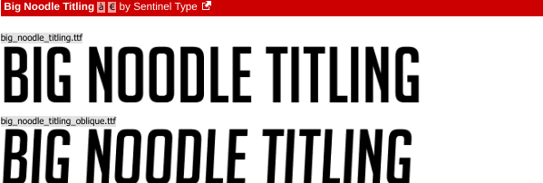
My masthead: Film Fix will be in full capital letters. The strapline may be either fully lowecase or only the first letter of the sentence or each word will be capitalised. This is to provide visual contrast and for maximum effect.
My headline will be bold and in a large font size. Some of the words in the strapline like antidote, discerning and addict will be in itallics for emphasis. The strapline will be smaller to differentiate between the two types of text. It is likely to be between size 13-16. In terms of spacing, the letters will be immediately next to each other to show that they belong to the word that is being spelt.
Colour: Yellow and Blue: Blue for the Masthead, Yellow for the strapline:
The Perfect Antidone For The Discerning Film Addict.
It is likely that I will go with the Sunshine font as I think Mega Punch is too thick and although not the thinnest San- Serif font available on DaFont I feel it is too small for my desired aestetic on the front cover and it will get lost amongst the larger titles on the shop shelves.


No comments:
Post a Comment