Tuesday 30 April 2024

Nicholas Norris Completed NEA

 Dear Moderator, 

My name is Nicholas Norris . Welcome to my A Level Media Studies blog. This is a record of the work I have undertaken for the Making Media Non-examination Assessment (NEA) within the OCR H409 GCE A Level course in Media Studies. 

I worked independently on Brief 3: Magazine and Online to produce the front covers and contents pages for the first two editions of a film magazine called Film Fix together with the magazine's accompanying website.

Research and Planning

Further down in my blog you will find evidence of my research and planning for this task.

Magazine Covers and Contents Pages

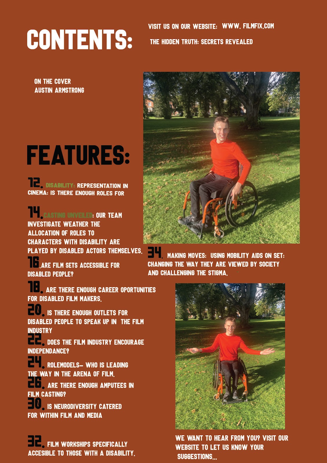
Magazine first edition cover and contents page


Magazine second edition and contents page


Magazine Website

The link to my website, which was created using Wix, can be found at the link below. 

The magazine consists of a homepage and a single linked page. This page can be accessed by clicking on the  featured articles tab.


Tuesday 12 September 2023

NEA Task 21 (Planning) Photography Planning

Now it is time to ensure that you have a plan for your original photography in relation to casting and mise-en-scene.

In order to meet the set brief you will need to have, as a minimum,

  • 4 original images for your magazine covers and contents pages (at least one image on each of these)
  • 2 original images for your wesbite (one on the homepage and one on the linked page)

In order to be able to undertake a successful photoshoot to capture images you need a plan.

1. Who will you be using as your models for each photograph (bear in mind that your photographs need to show representation of two distinct social groups)

I recommend doing some sample photographs with people you are considering using as this will help you to see how they 'perform' when having a camera in their face and are being 'directed' by you.

In relation to 'representation of two distinct social groups' I would advise you keep it both simple and obvious by representing two different genders or two different ethnicities across the two covers.

For the directors issue I am going to use a middle aged male to represent the social group of males and the age demographic of 40-55.

For the diversity of the issue - use of a female/or myself as the disability demographic - 16-20


2. What thought needs to be given to the following elements of mise-en-scene?

Location for photography? Bear in mind that the two main images for each front cover must show "a different use of mise-en-scène". Simply put, you need to plan to take photos in two different settings. My advice would be to do one as an interior shoot and the other as an exterior shoot.

One will be inside - this will be the director, office location/classroom representing planning meeting.

Second - outside - recreational place - benches/park area showing integration into society.

Costume? What will your models be asked to wear for the photoshoots? Costume is a key element of mise-en-scene and communicates messages relating to representation. You should not have your models just turning up wearing what they want; you have to direct this.

For the director - smart formal business dress

For the diversity - causal clothes/normal attire

Props? Will you need any props for your photoshoots? This could be something very simple or something more elaborate BUT it has to be planned.

For the director - notebook and pen/laptop - pictures of diversity on the laptop showing planning meeting of previous shots taken. (looking at the front cover)

For the recreational shot - bench, coffee cups/drink bottle, wheelchair/mobility aid to show diversity- showing picnic/drink meet up etc

Body language of model? How do you want your models to behave? Their body language will communicate meaning. Are they going to be serious and moody or fun and frolicky*? *not a real word.

Director - serious and formal, showing professionalism and businesslike atmosphere more sincere.

recreational - informal chat, relaxed friendly chatting smiling.

Lighting? Will you need to give any consideration to lighting for your photography?

Director - dark background, with a focused light on the director showing shadow and the use of the laptop light coming through

recreational - natural daylight (hopefully sunny)

3. Who will be taking your photographs and what equipment will they use?

Remember that you do not have to take the photographs yourself so if you know someone who is a keen amateur (or professional) photographer then you can enlist their help. The only rule is that they must act under your direction.

There is no need to use expensive camera equipment for your photography - most modern mobile phones have extremely high performance in relation to photography.

Me, or family member under my direction, friend, under my supervision and direction.

Finally, if you need 6 photographs take 60 photographs. The more images you have to use and choose from the better your completed production will be.

NEA Task 20 (Planning): Website Page and Linked Page.

Website Banner Plan 

 1. What will your website header and home page look like? 

It will be in a bold, modern colour like yellow and be of a San- Serif. 

The image found on each of the front cover will be referenced on the homepage of the film magazine. 

The appropriate conventions of website design are an original title: Film Fix. This is an example of cross media convergence. 

I think I will go blue for the main logo in the sunshine font and the strapline will be yellow. The sunshine font will be repeated throughout the magazine like on the masthead as headings. 

I will limit the colours to 3 so that it is not busy. 

There will be a banner at the top introducing the latest issue of the magazine. 

I will use buttons so that the user can go from page to page and find the infomation they need. 

These feature on almost every film magazine website. 

For the buttons I will include: Latest, Features, Reviews, Equality, Buy, About Us. 

Thursday 15 June 2023

NEA Task 17: (Planning) Coverlines, Images, Page Furniture:

  • Main coverline
1. The main coverline will be in a bold San Serif 
DIRECTORS
The 10 Upcoming Directors to watch out for

Coverline:  
CINEMA:
The best in the country. 
Content plugs:
Behind the Scenes 
Planning a new film 
Insights from those involved in creating a film.

'' First we have a brainstorm meeting, then these are made into a storyboard, we then decide our Mise-En-Scene for the movie.'' - Pull Quote 

Insights and Interviews+ much more: - Puff

Corner: NEW

Main image: Dad/ Brook - above the headline: a headshot 

William Jones: This pioneering director is capturing the imaginations of young audiences one film at a time. 

INFLUENCE, ESCAPISM. DOPAMINE. (3 words at the top.) 
-----------------------------------------------------------------------------------------------------------------------------
INFLUENCE, ESCAPISM, Dopamine (3 words at the top) 
Main Coverline: 
DIVERSITY
Is there enough variety in film. 
Coverline:
The main coverline will be bold San- Serif. 
DISABIlITY
Is there enough genuine representation in casting and the industry. 

'' It is shocking to me that a large of proportion of actors playing characters who are disabled do not actually have a disability in real life.''


Content Plugs: 
POC challenging stereotypes and prejudice 
Childhood actors in the spotlight 
A look back on the greats of film (old people)
Females in Film Production. 
LGBT pioneers of Cinema. 

Making sure everyone is heard: Puff. 

Corner: NEW

Main image: me
Man: Austin Armstrong : Ableism in the film industry finally brought to the forefront. 
Lady: Ruby Bedford 


Tuesday 13 June 2023

NEA Task 16: Masthead Design: draft


                                                                       My masthead: Film Fix will be in full capital letters. The strapline may be either fully lowecase or only the first letter of the sentence or each word will be capitalised. This is to provide visual contrast and for maximum effect. 

My headline will be bold and in a large font size. Some of the words in the strapline like antidote, discerning and addict will be in itallics for emphasis. The strapline will be smaller to differentiate between the two types of text. It is likely to be between size 13-16. In terms of spacing, the letters will be immediately next to each other to show that they belong to the word that is being spelt. 

Colour: Yellow and Blue: Blue for the Masthead, Yellow for the strapline: 
The Perfect Antidone For The Discerning Film Addict. 

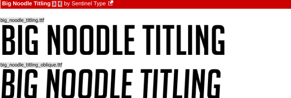
It is likely that I will go with the Sunshine font as I think Mega Punch is too thick and although not the thinnest San- Serif font available on DaFont I feel it is too small for my desired aestetic on the front cover and it will get lost amongst the larger titles on the shop shelves.


Nicholas Norris Completed NEA

  Dear Moderator,  My name is Nicholas Norris . Welcome to my A Level Media Studies blog. This is a record of the work I have undertaken for...